<?xml version="1.0" encoding="utf-8"?>
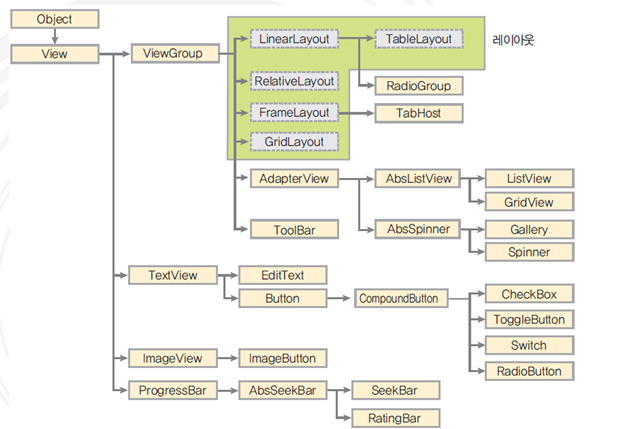
안드로이드의 View Class의 상속을 받은 클래스(위젯) 계층 도
android:id="@+id/btn1"
android:layout_width="wrap_content"
android:layout_height="wrap_content"
android:background="#ff0000"
android:text="This is Button"
<Button> </Button> 사이에는 Button의 XML 속성 정의
#ff0000(RED)에서 #은 16진수를 의미하며, 앞에서 부터 2자리씩 차례대로 R, G, B 색상을 의미(각각 8비트)
XML
id 속성
*.java
//위젯변수 = (위젯형) findViewById(R.id.위젯id); XML의 버튼 아이디를 자바에서 명시
Button button1;
button1 = (Button) findViewById(R.id.btn1) // "btn1"은 XML에서 정의해준 button id
*.xml
...
android:orientation="vertical"
android:id="@+id/textView1"
...
android:id="@+id/female"
...
android:id="@+id/male"
...
layout_width, layout_height 속성
android:layout_width="match_parent"
android:layout_height="wrap_content"
android:text="This is Button"
wrap_content // 버튼 내부의 텍스트 크기에 맞춰서 버튼 크기를 설정
match_parent // 위젯의 부모 클래스(레이아웃)에 맞춤
1080px // 버튼의 너비(높이)를 1080 pixel로 지정
background 속성
android:background="#ff0000"
...
android:layout_width="wrap_content"
android:layout_height="wrap_content"
android:background="#00ff00"
android:text="Green Color Button with Red BackGround"
padding 속성
위젯으로부터 간격 설정(위젯과 레이아웃 사이 간격)
간격이 없는 XML 코드(without padding)
android:text="Enter Your name:"
android:hint="Fill up this box"
android:text="Confirm"
EditText는 text를 집어넣을 수 있는 박스이다.
hint는 투명한 글씨(입력을 넣을 시 사라짐)
간격이 있는 XML 코드(with padding)
android:padding="30dp"
android:text="Enter Your name:"
android:hint="Fill up this box"
android:text="Confirm"
padding=30dp로 설정하면 양쪽에 30dp 만큼의 여백을 두고 레이아웃을 채운다.
layout_margin 속성
위젯과 윗젯 사이의 여백을 띄울 때 사용
android:padding="30dp"
android:layout_margin="20dp"
android:text="Enter Your name:"
android:layout_margin="20dp"
android:hint="Fill up this box"
android:layout_margin="20dp"
android:text="cofirm"
위젯과 위젯사이 20dp씩 간격을 생성
visibility 속성
android:text="Button 1"
android:visibility="invisible"
android:text="Button 2"
android:visibility="visible"
android:text="Button 3"
android:visibility="gone"
android:text="Button 4"
android:text="Button 5"
visible: (default)
invisible: 안보이지만 해당 자리는 남겨둠
gone: 안보이고, 해당 자리 또한 남겨두지 않음
enabled, clickable 속성
enabled는 버튼의 동작여부를 설정
clickable는 버튼의 클릭할 수 있는지 여부를 설정
android:text="Button 1"
android:enabled="false"
andoird:text="Button 2"
android:clickable="false"
android:text="Button 3"
enabled=“false” 로 설정하면, 버튼이 비활성화 된다.
clickable=“false”로 설정하면, 버튼이 활성화된 것처럼 보이지만, 동작하지는 않음
(java에서 다시 활성하 시키는 동작을 처리 가능)
rotation 속성
android:text="Button 1"
android:text="Button 2"
android:rotation="45"
android:text="Button 3"
rotation으로 지정한 각도만큼 시계방향으로 위젯을 회전